PROBLEM
People don't want to lug their luggage around a huge international airport trying to get food or have to wait in line to get food. They also might have language barriers preventing them from easily and effectively ordering.
SOLUTION
Offer multi-language food delivery and pickup services for restaurants near your location in the airport via an app.
RESEARCH
I started by looking at what other food delivery apps did to get an understanding of what users might already be used to and expect.
For this purpose I reviewed:
- Seamless / Grubhub
- Doordash
- Postmates
- Uber Eats
All of them offer the option to select between delivery and pick up. They also allow you to easily select and change your location.
The overall experience is about the same between them all. I based my experience flow loosely on that of these apps.
I also stylistically try to align with the look and feel of these apps, as we want this to be something users feel comfortable users.
PERSONAS

Nick B.
Age 32
- Avid Traveler
- Speaks 3 languages
- Always looking for something new to try
- Spends a lot of time in airports, train stations, bus terminals, etc.
- Usually travels alone and stays on friends couches
- Works remotely to facilitate his semi-nomad lifestyle

Angela G.
Age 47
- Occasional Traveler
- Only speaks English
- Looking for things that are easy and affordable
- Has her kids and partner with her
- Usually stays in a homestay or hotel for privacy with her family
- Works part time to supplement her family income but mostly is a parent
USER EXPERIENCE FLOW
A bit about this...
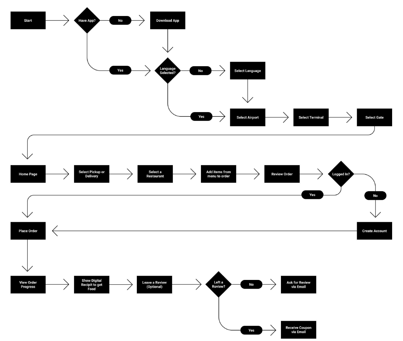
For this flow I wanted to cover the main experience and choices a user would have to make during an average interaction with the app. I didn’t cover every action possible or accurately represent the pages.
I believe an important factor of this flow is the first few selections.
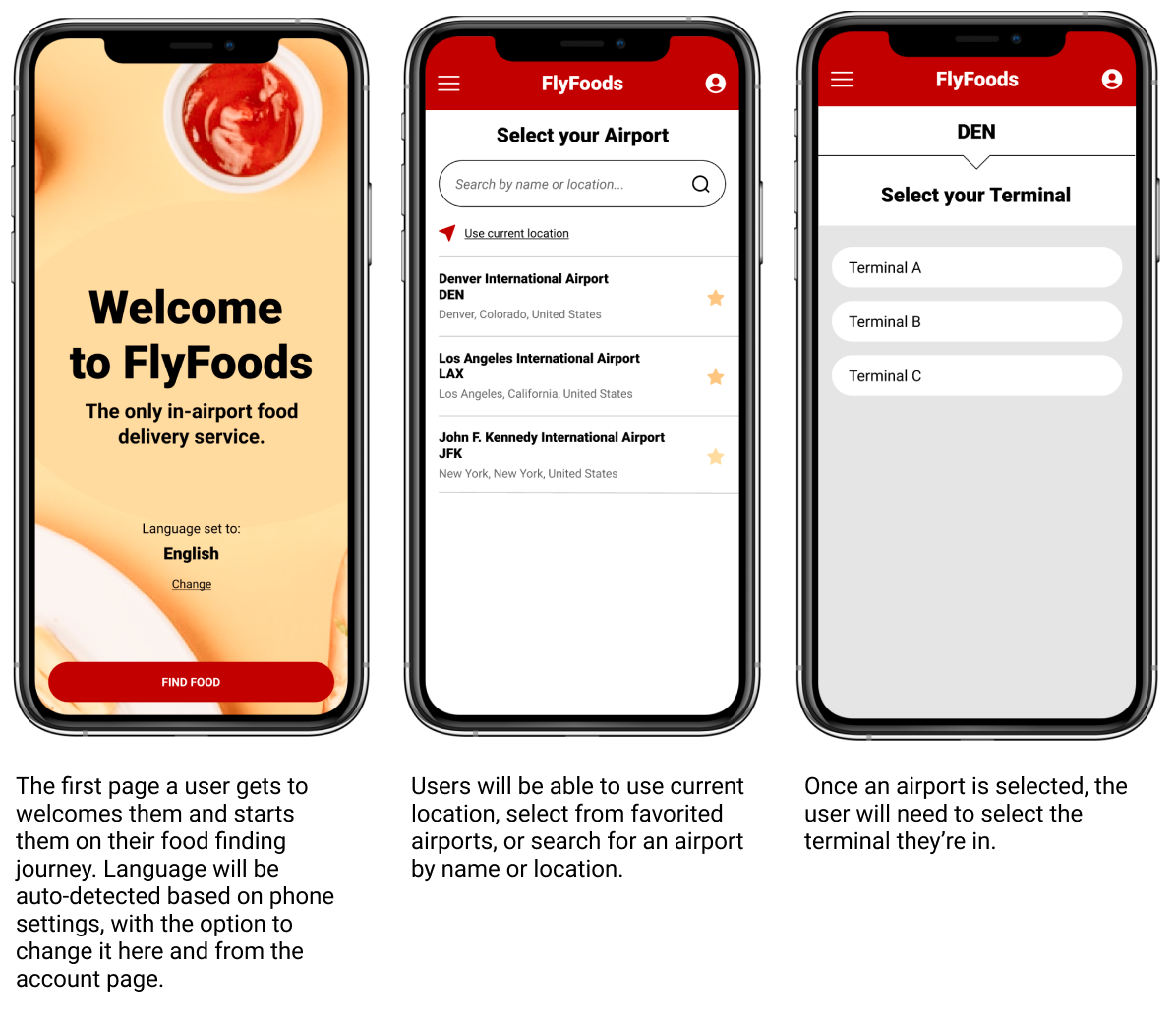
The very first of which is selecting language. Given that this is for international users, that will be the first obstacle to overcome.
The second selection is your location. Each time you open the app you’ll be prompted to select your location. It intentionally does not remember your location because this is likely to be new each time, and thus should be seamlessly built into the experience.
Once a user has a location selected, it will be much like any other food delivery app.
I believe an important factor of this flow is the first few selections.
The very first of which is selecting language. Given that this is for international users, that will be the first obstacle to overcome.
The second selection is your location. Each time you open the app you’ll be prompted to select your location. It intentionally does not remember your location because this is likely to be new each time, and thus should be seamlessly built into the experience.
Once a user has a location selected, it will be much like any other food delivery app.
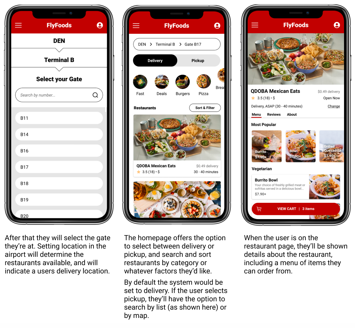
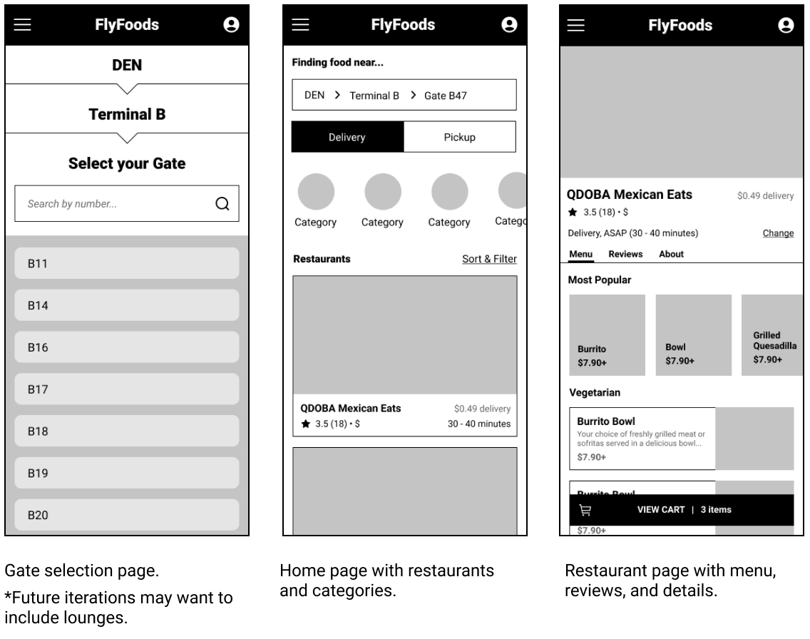
The user will land on a homepage with delivery selected by default, and a list of nearby resturants will be offered to the user to select from. This will show a list and a map view for ease.
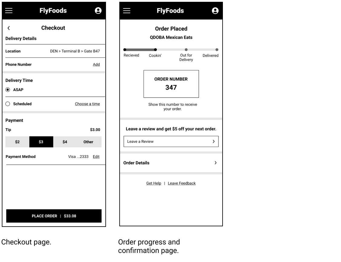
A user will only have to make an account if they choose to order through the app. This allows users to browse what is available to them without any barriers of signing up.
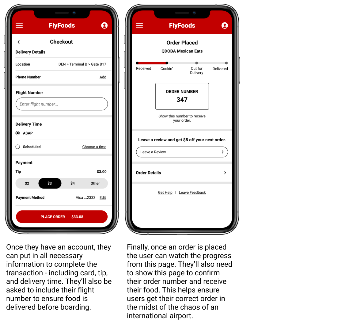
To ensure a user gets their delivery or pickup order, the user will have to show a digital reciept to get their food. This will display to the user on the same page they see their order progress.
When the order is determined delivered or picked up, the user will be prompted to submit a review, with the incentive of an in-app coupon for doing so.
A user will only have to make an account if they choose to order through the app. This allows users to browse what is available to them without any barriers of signing up.
To ensure a user gets their delivery or pickup order, the user will have to show a digital reciept to get their food. This will display to the user on the same page they see their order progress.
When the order is determined delivered or picked up, the user will be prompted to submit a review, with the incentive of an in-app coupon for doing so.
WIREFRAMES
Here I outline what actions and information need to be included on the main pages of an average flow interaction.


HI FIDELITY DESIGNS
As can happen in any creative process, the design morphed and bloomed from what I proposed in the wireframes.