Role: Lead Product Designer
Team: 1 Product Manager, 6 Engineers, 1 Designer/Researcher
Tools: Figma, Dovetail, Jira
Team: 1 Product Manager, 6 Engineers, 1 Designer/Researcher
Tools: Figma, Dovetail, Jira
Overview
Sovos is a B2B tax compliance software company. FormView was one of its core enterprise products — used by hundreds of clients to view and manage tax forms — but it hadn’t been meaningfully updated in over a decade. The goal was to redesign FormView into a modern, efficient, browser-based experience that felt intuitive to use and easy to demo.
The Problem
The original FormView was powerful but outdated.
• The UI was cluttered and inconsistent.
• Key workflows were buried, frustrating users and increasing churn.
• Marketing and sales teams struggled to demonstrate the product effectively.
Project Goals
• Simplify and modernize the interface while keeping feature parity.
• Reduce task completion time for customer service agents.
• Align the UI with the Sovos design system.
• Enable browser-based access for scalability and reach.
Research and Insights
I started by immersing myself in the product to understand current workflows and friction points. Then, I identified and interviewed key user groups:
• 5 Customer Service Agents — primary users handling daily tax form requests.
• 3 Tax Professionals — frequent users editing or verifying form data.
• 2 Casino & Gaming Clients — secondary users focused on identity validation.
Main Tasks
• Download and send tax form PDFs.
• Request or make edits to form and recipient data.
Key Friction Points
• Downloading PDFs was tedious and multi-step.
• Difficult to locate forms across tax years.
• Requesting edits required manual communication.
These insights made it clear that the product’s biggest issue wasn’t missing functionality — it was workflow inefficiency
Ideation
Ideation started by clarifying our goals:
• Simplify workflows.
• Update visuals to align with the Sovos design system.
• Maintain feature parity.
We held collaborative workshops with the product manager, tech lead, engineers, and business stakeholders to brainstorm solutions that balanced usability, feasibility, and business goals.
Key Solutions
• Create PDF Button: Reworked as the main call-to-action with clearer language and placement.
• Tax Year Navigation: Added visual year indicators, color coding, and consistent labels.
• Edit Requests: Introduced a secure “copy link” feature for clearer communication and fewer errors.
Wireframing
I created low-fidelity wireframes to map out user flows and validate structure early. These evolved through multiple iterations until the team aligned on an approach that improved usability without disrupting the product’s core logic.
Design System
Leveraged and expanded the Sovos design system, collaborating with other designers across business units to ensure scalability.
• Completely redesigned form input fields for clarity and accessibility.
• Created 20+ reusable components that were later adopted across Sovos products.
Prototyping
Built clickable prototypes in Figma for usability testing and internal demos.
These prototypes were instrumental in aligning stakeholders and gathering feedback early.
These prototypes were instrumental in aligning stakeholders and gathering feedback early.
Final Design
Each page was reimagined for simplicity, hierarchy, and readability.
Key updates included:
• Simplified task flows and improved spacing for readability.
• Clearer language and inline guidance.
• Consistent, modern design aligned with the Sovos design system.

Above is the landing page for the product. On this page, customer service agents choose to search for tax forms by a customers TIN (Tax Identification Number, such as a Social Security number), account number, or name.
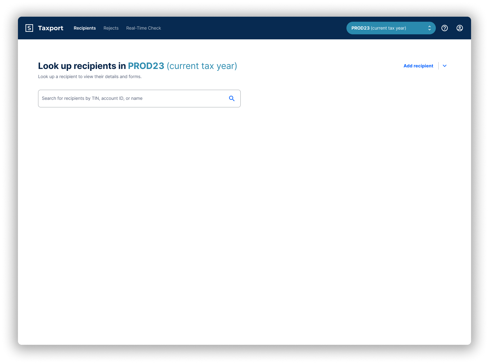
The landing page now clearly highlights which tax year the system is in. We also simplified and smartened the search so that users don't have to select what they're searching by.
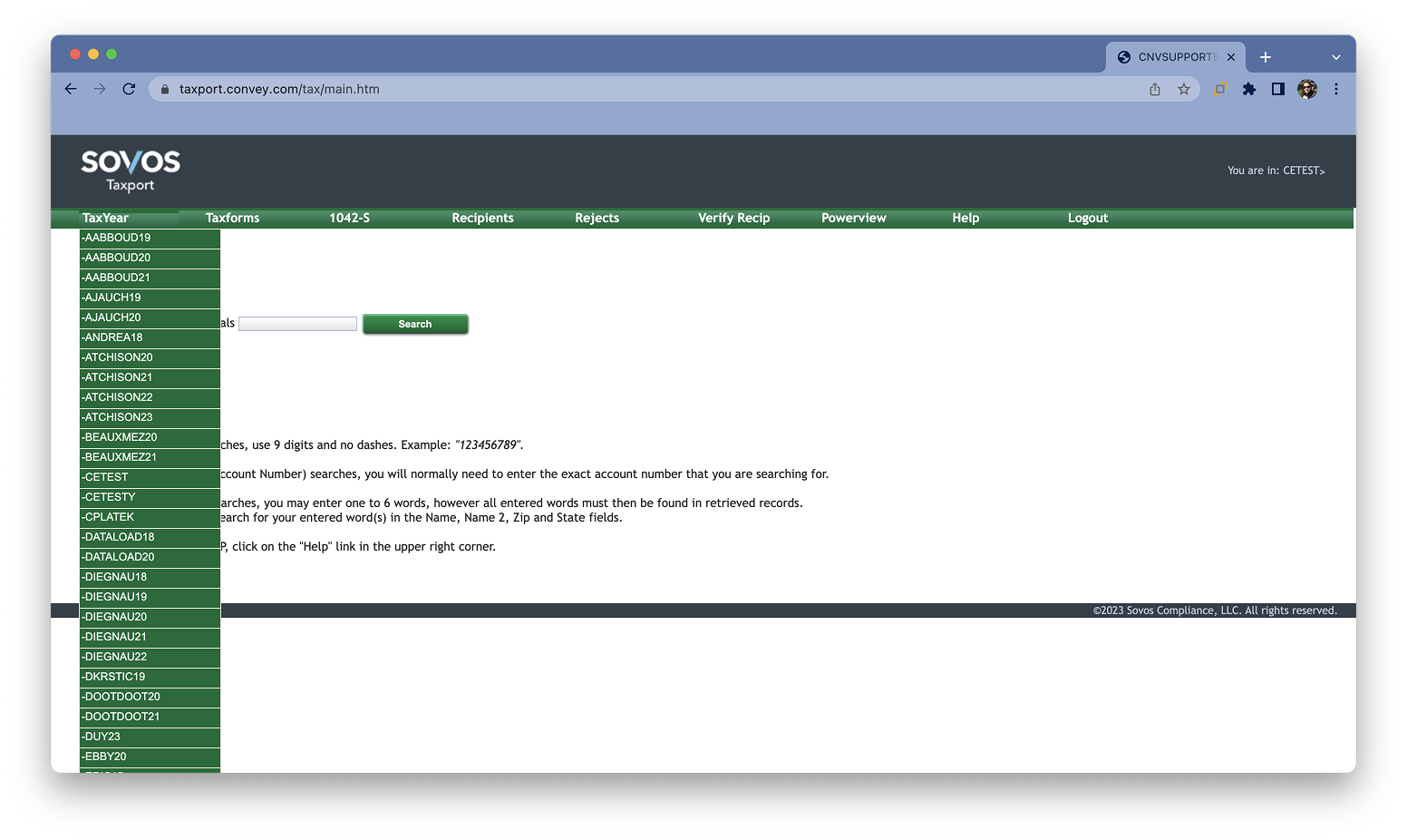
Here we see the dropdown to select a tax year to search in.

When a recipient is not found, options for other tax years come up. If clicked, these buttons will rerun the search in that tax year.
The tax year selection drop down is now easier to read, using labels and color to guide users. We bucket tax years into three categories: current tax year (turquoise), not current tax year (purple), test environment (grey).
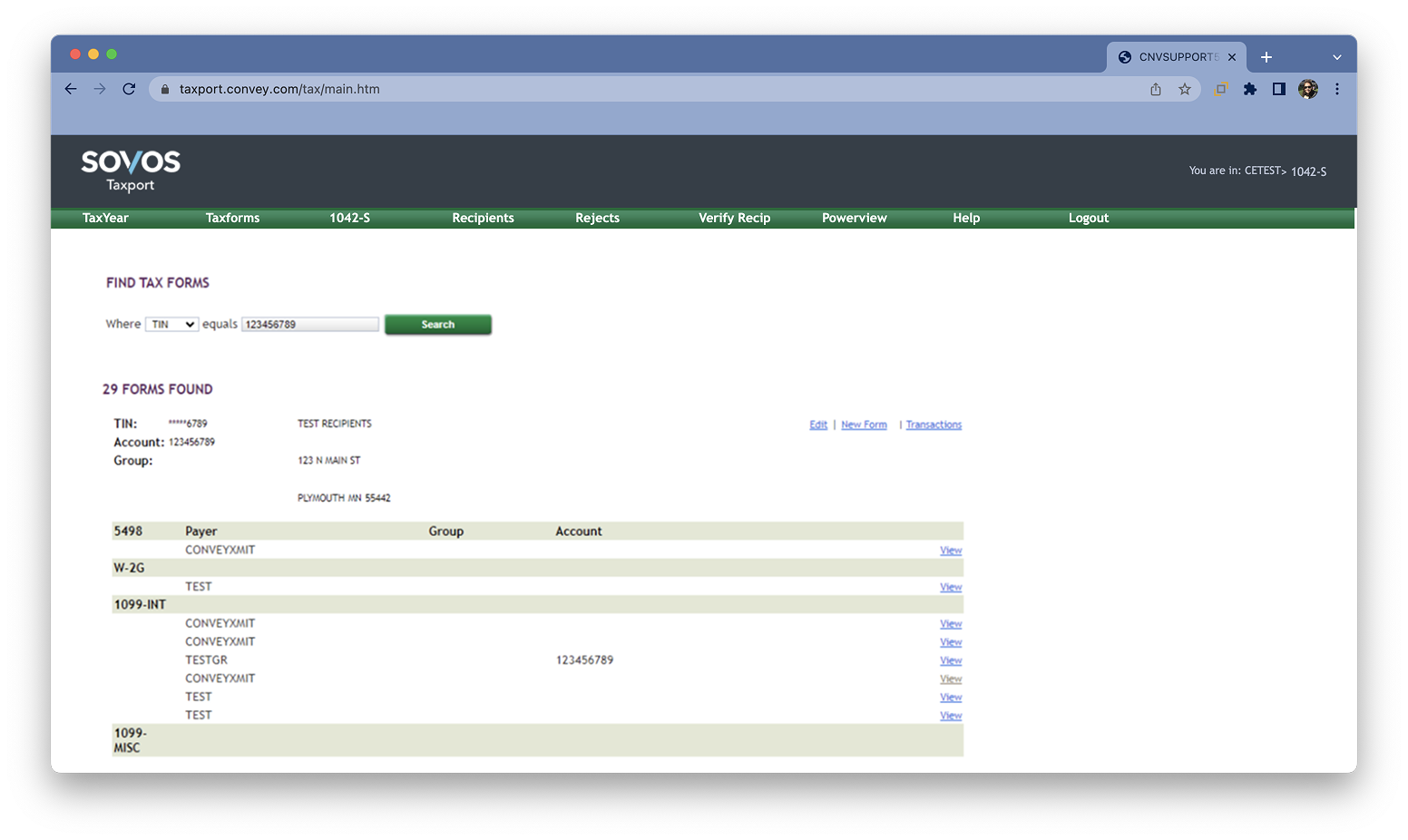
This is an example of search results. This is showing a single recipient with 29 tax forms being returned. For a customer service agent to download a PDF of one of these forms, they first need to click "View" on the desired form. "View" opens a browser default PDF view of the tax form where they will need to confirm it's the correct form, and download it. If they're not sure which tax form they need, they'll need to open each form individually.
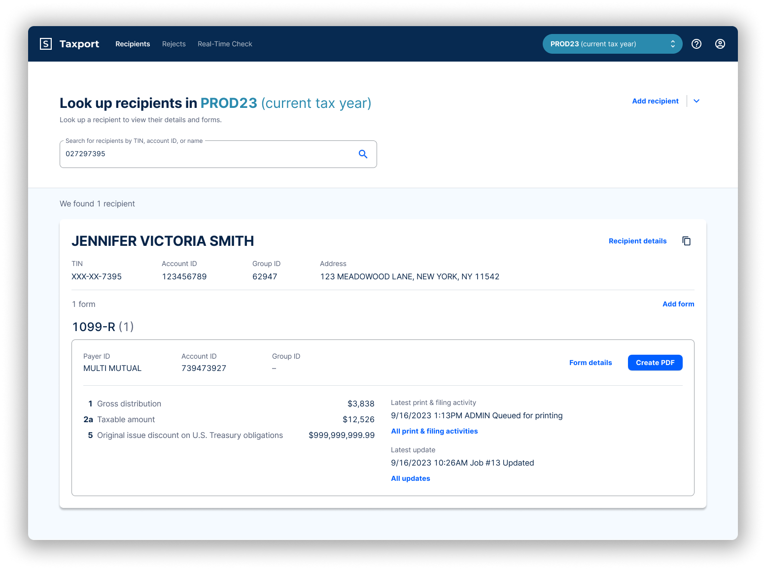
Customer service agents can now create the tax form PDF right from the search results page. And because more information is now shown about the recipient and form(s), customer service agents don't need to open and review a PDF of the actual tax form for confirmation.
The copy link button is found as the copy icon at the top right of the recipient result box.

Details about tax forms collapses when there are more than 3 forms for a recipient. Each tax form listed can be expanded to show the full details. This allows large amounts of forms to be scannable, while maintaining easy access to more information.
Note that the most common results case is 1 recipient and 1 tax form for them. Less common is multiple forms for a single returned recipient. Rarely, multiple recipients will be returned if a search is done by a common name.
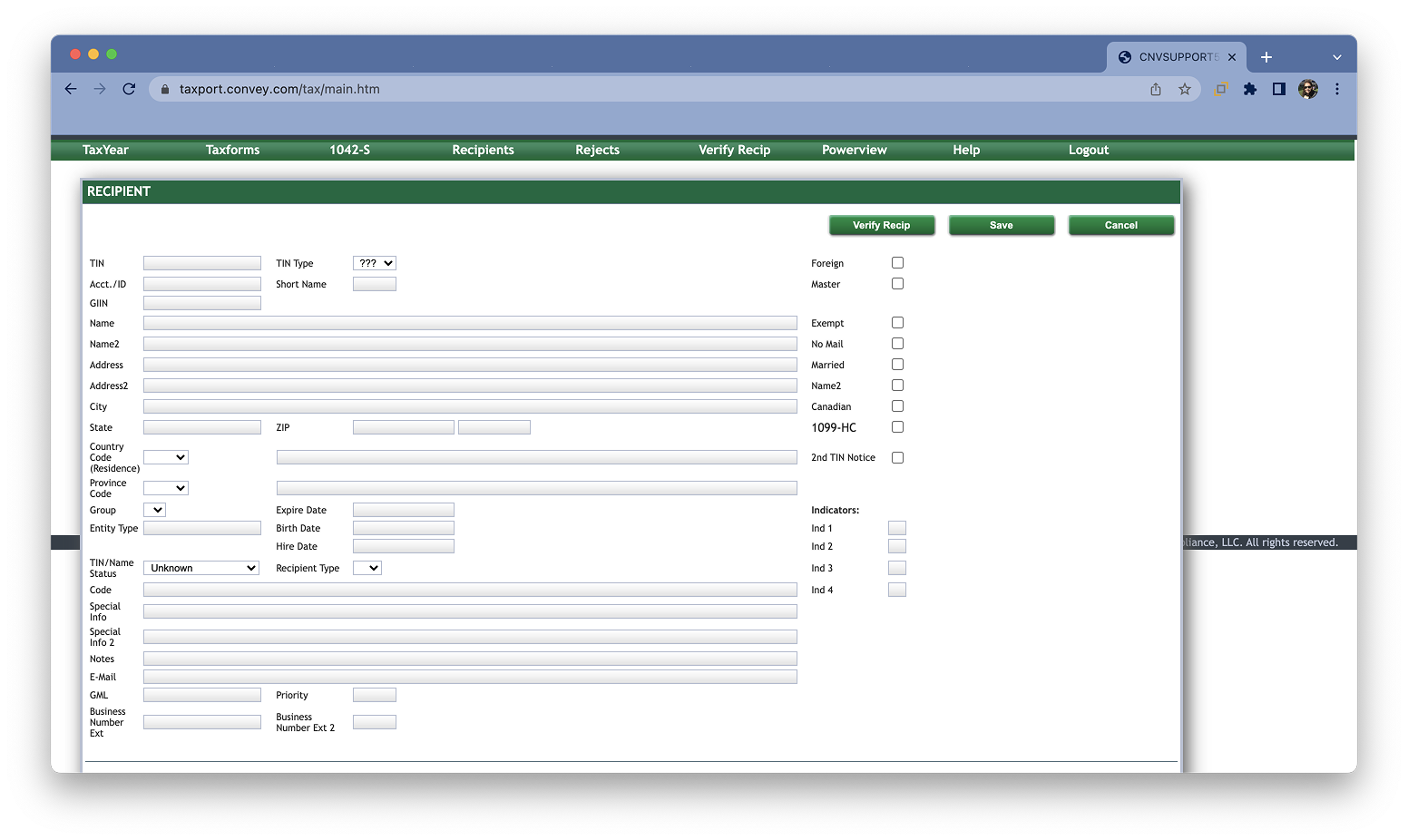
If a user chooses to "Edit" on the search results page, they're taken to the Recipient details page above. Depending on user permissions the data can be edited in addition to viewed. Most customer service agents do not have edit ability. If "Verify Recip" is clicked, an identity check is run on this recipient and results are shown on the TIN Matching page, below.
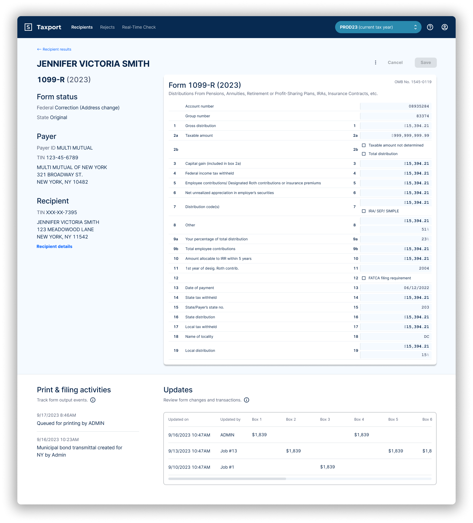
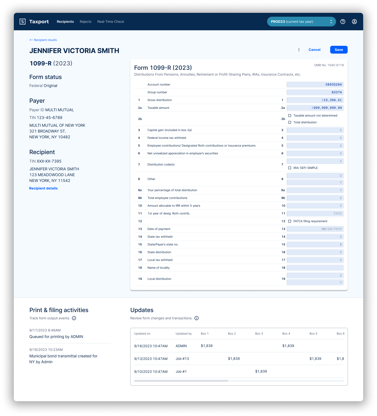
Here we see a read only tax form details page, as a customer service agent would see it. Before, tax form details pages were hidden from customer service agents, making it harder for them to confirm tax forms.
Below is an editable version, used by tax professionals.
Below is the revamped recipient details page. "Verify Recip" is now the Real-time check section, which allows an identity to be validated on the page.
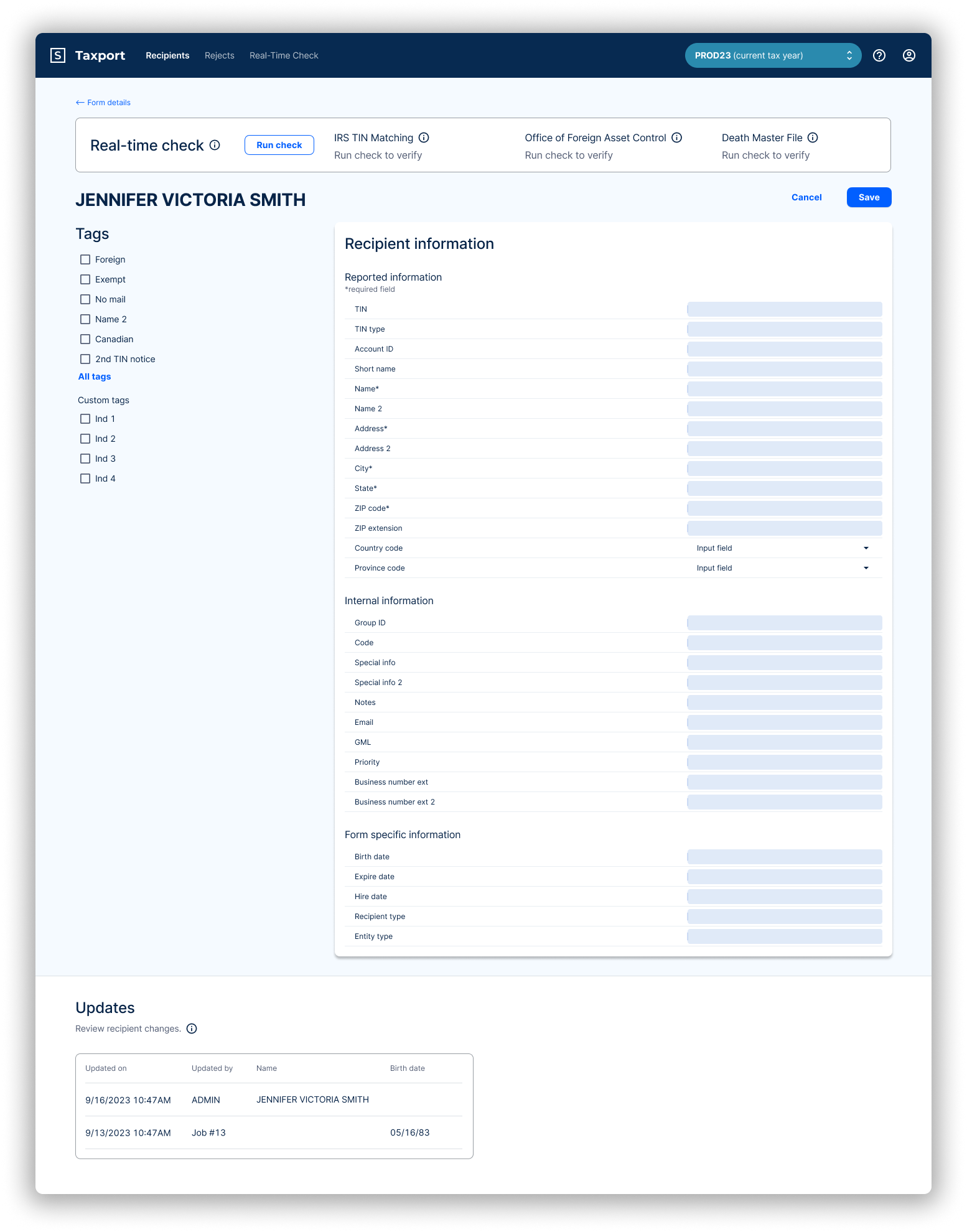
Below is the revamped recipient details page. "Verify Recip" is now the Real-time check section, which allows an identity to be validated on the page.
Below is TIN Matching, which is predominantly used by casinos and gaming houses to validate someones identity.

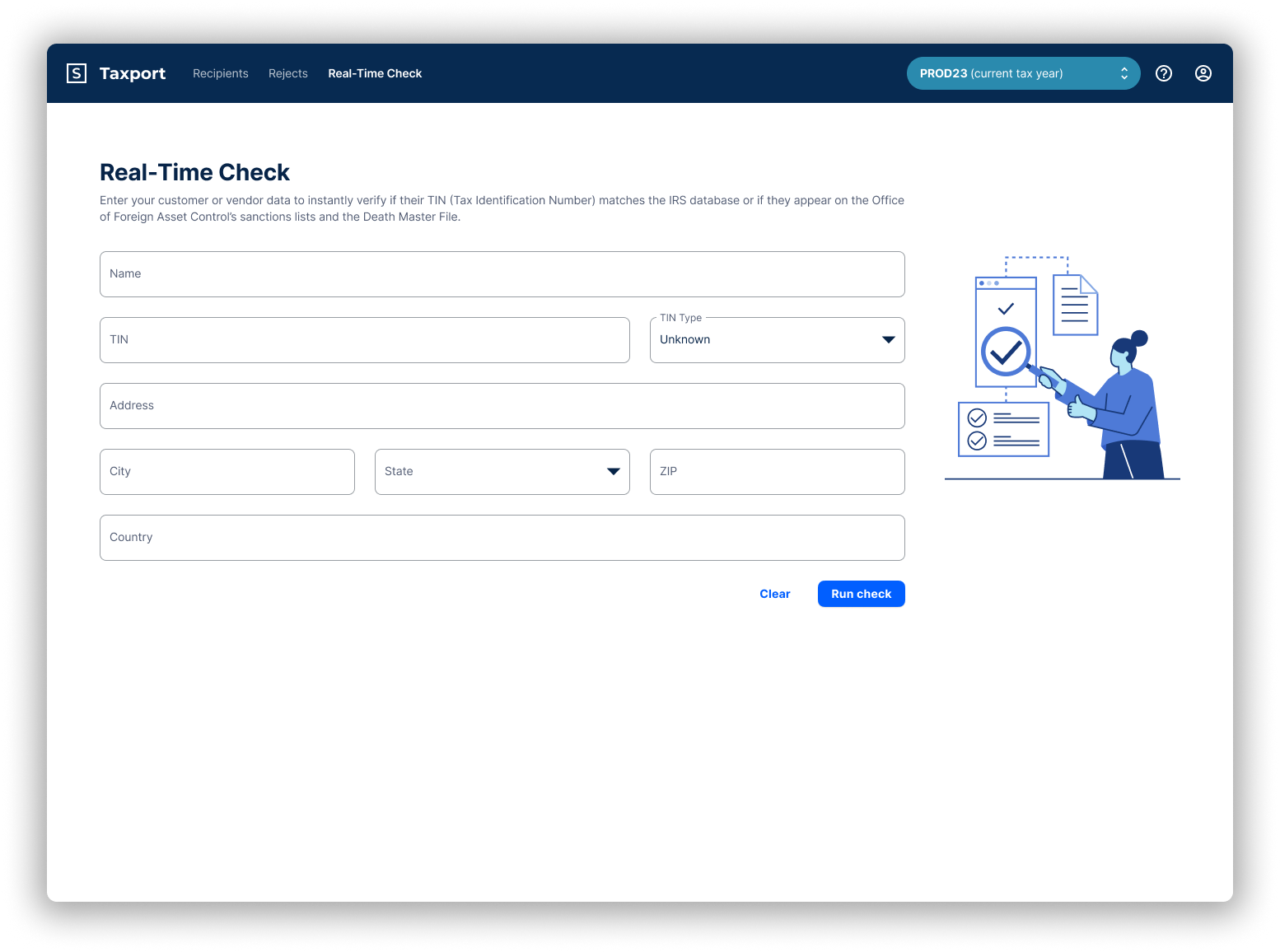
For casinos and gaming houses, the Real-time Check page is heavily used. It's kept all the original functionality, just cleaned up a bit.
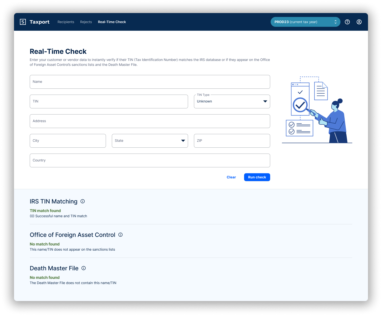
The page showing results below now includes explanation information.
Results & Impact
User Outcomes
• Reduced PDF retrieval steps by 2.
• Improved accuracy and speed when updating recipient records.
• Easier navigation between tax years validated during user testing.
Internal Outcomes
• 100% adoption of new components in all new form-related projects.
• Delivered on time for tax season.
• Marketing and sales teams reported stronger demo confidence and higher close rates.
Challenges & Lessons
• Worked within strict technical and timeline constraints.
• Advocated for user needs despite backend limitations.
• Helped introduce design system adoption and Figma dev mode to the broader team.
This project taught me how to drive alignment in complex, cross-functional environments and deliver strong results even within constraint-heavy systems.